By Kathleen Weessies & Karen Majewicz
This Dashboard is one of the most commonly cited public sources of aggregated Covid-19 data, as it delivers public health statistics using easy-to-understand maps and charts. Users do not need to load the GIS data in external applications to analyze it.
However, if users would like to go deeper and make maps or charts of their own, many of the geospatial datasets in the portal are also discoverable in Esri's Covid-19 Hub.
One of the primary datasets in the JHU Covid-19 Dashboard is COVID-19 Cases Worldwide. This dataset is updated hourly and categorizes the cases as confirmed, recovered, deaths, and/or active.
Since, this data is aggregated from many sources, users will see that the way the information is organized varies from place to place. For example, many regions do not provide information on "recovered" cases.
The administrative units in the dataset also vary across the world. In the United States, the data is collected by county. By contrast, in Canada, the data is collected by province. In France, the data is only displayed at the national level.
Have questions about this item, the BTAA geoportal, or maps and geospatial data in general? Please don’t hesitate to contact our project team!
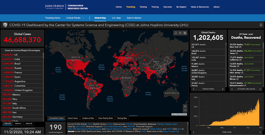
Featured Item: Johns Hopkins University Covid-19 Dashboard
Early on in the worldwide outbreak of COVID-19, Johns Hopkins University took the lead in creating a portal of frequently updated data feeds. It pulls together up to 600 datasets including medical cases, hospitalizations, deaths, recoveries, stay at home orders, essential vs. nonessential business designations, and travel and quarantine orders.This Dashboard is one of the most commonly cited public sources of aggregated Covid-19 data, as it delivers public health statistics using easy-to-understand maps and charts. Users do not need to load the GIS data in external applications to analyze it.
Screenshot of the Johns Hopkins University Covid-19 Dashboard on November 2, 2020
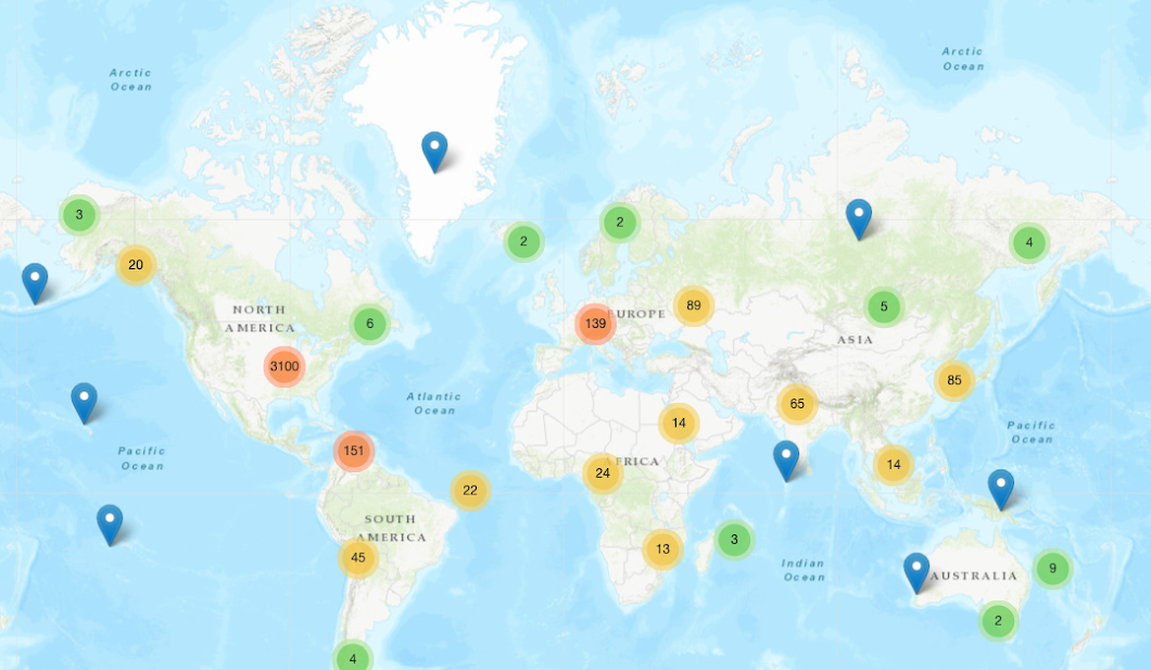
COVID-19 Cases Worldwide: Data points indicate location of available case numbers (not total cases)
However, if users would like to go deeper and make maps or charts of their own, many of the geospatial datasets in the portal are also discoverable in Esri's Covid-19 Hub.
One of the primary datasets in the JHU Covid-19 Dashboard is COVID-19 Cases Worldwide. This dataset is updated hourly and categorizes the cases as confirmed, recovered, deaths, and/or active.
Since, this data is aggregated from many sources, users will see that the way the information is organized varies from place to place. For example, many regions do not provide information on "recovered" cases.
The administrative units in the dataset also vary across the world. In the United States, the data is collected by county. By contrast, in Canada, the data is collected by province. In France, the data is only displayed at the national level.
Have questions about this item, the BTAA geoportal, or maps and geospatial data in general? Please don’t hesitate to contact our project team!